
Let's face it. Hanging art or photos on walls is a tough job. Not only is it an activity that leaves you with tired arms, but it's possible that the way your pieces are hung will never do them the justice they deserve!
The first, and often most difficult step, is choosing the look you want to accomplish. Gallery walls can be done in a very planned, methodical way and completed at once, or you can create a look that allows you to continually add to it and refresh the space with a more random approach. It really depends on you, your personal style, and the look you are wanting to accomplish for your home or office. Here are some helpful suggestions of how to organize your own galleries, or make them look completely unorganized; intentionally of course.
Starting with the hall above... which is, in a word... stunning. The size of these frames is large and dramatic which can be a great addition to a room that needs that bit of drama. The simple dark frames with their large, white matting (the white space between the frame and the artwork) adds great contrast to the grouping. Keeping with the same subject in each frame makes for a more sophisticated vibe going down a hallway; the theme here being a very modern approach to images of horses. I'm also totally diggin' the rug with it's very bold pattern but very neutral color combo.

A simple and very useful tip is to create and hang paper cutouts traced from your frames. This allows you to see if you like the idea that's in your head as much as you hope to. Not only does this help with laying out your pieces, but it also is extremely efficient with visualizing the scale of the pieces together with the size of your wall. Many times frames look like are going to be the perfect size, but once hung on the wall, you realize that they are either too small, or a bit too large for the space.
This diagram below can be really helpful when it comes to choosing the size of frames to use in the collection for your gallery wall.

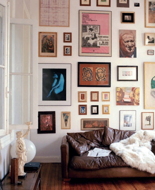
More useful tips and inspiration...
This wall has a very creative, artistic feel. In fact, you might not recognize that all of the frames here are arranged in a very column-like method. You can see that there is a very nonchalant collection of images going into each column, which makes this style seem very easy going. Having a variation of frames and colors also adds to that feeling, making the pieces feel like an eclectic personal collection gathered over time. Notice how many different sizes of images and frames are in this collection as well, while still creating a type of grid. It’s a little bit more unexpected and adds personality to the room, without feeling unorganized or cluttered.

Being able to move your frames around in any which way in this gallery is so easy! You are able to switch up your space in just a couple of minutes without having to make any new holes in walls or get out the hammer. That is of course, once you've already hung the shelves securely. Making sure that your shelving is attached to studs becomes very important. Frames and the glass in them can get fairly heavy with a grouping like this, so you need to make sure that nothing will give out. I love how this scene is done mostly in black and white, with the exception of some brown in the furniture and the chrome of the fixture. Doing so makes this dining space seem a bit more dressed up.

TV’s are something that many people struggle with in certain rooms throughout the house. For many, having the television be a focal point is really no big deal. Personally, I don’t watch a ton of tv, and would prefer that the large dark box not hog all the attention. Mixing in a mounted system surrounded by frames is such a great way to switch it up. Although it is still a very bold rectangle, it seems less important when there are so many other neat pieces around it. Mounting the TV gives more room to display other favored items on the surface of the furniture below as well. The Kelly Green of that media console is also super beautiful and sleek. It stands out nicely against the light tones in this space.

Creating a gallery wall with a more random order over time can also be done in a clean way. Whether you like the simplicity of all white frames, or prefer to stick with darker tones, creating a common denominator works best. These white frames are lightweight enough to basically cover this entire wall. I appreciate the small set of keys that are thrown in the mix for some variety. Veering away from strictly frames leaves this wall a bit more playful. With the dark piece of furniture in this scene, I think the white frames were a lovely choice!

Last but not least is this really awesome wall for a children’s room done by our friends at SAS Interiors! Although this one is a bit custom with it’s recessed frames, I love that they are hung in such a simple and structured manor. Placing such large frames in a grid of nine that spans the wall is bound to give a room a sense of order… even at times when there are a billion different toys laying around.
Do you have an example of your own gallery wall or a style you love? Post a link and share it! You can find these examples and more on our Pinterest.
-
Genevieve Bandrowski

Comments on this post ( 0 )